Email Design for Nonprofits
It’s my pleasure to welcome Joel Eaton to the Nonprofit Campaign Lab. Joel and I delve into email design fundamentals and trends for nonprofits.
Standing Out in the Email Inbox
Why do we need to design an email? Why not send plain text emails all the time? Because some emails, like newsletters, work better with design.
The design also allows you to infuse your brand into the email. Great email design encourages people to read, engage, and open emails from you.
Unfortunately, email design makes me think of an activity—Spot the Difference. My kids love to get the Highlights magazine and play this game. Who am I kidding? I love to play it too. We race to see who can find all the differences. It has become sort of a contest in our house.
Well, sometimes the email inbox is like a giant game of Spot the Difference.
You open one email, then another, then another, then they all begin to look the same. It’s hard to spot much of a difference. No wonder people get tired of emails. Where’s the wonder, the enjoyment?
That’s why when I open an email that looks different I stop and read it. While, yes, email copy moves people to action, email design doesn’t get enough credit.
Before we look at some examples of great email designs and trends from nonprofits, let’s talk about standard design elements every email needs.
Email Design Best Practices
Mobile Friendly
Most people read emails on their mobile devices. If you don’t use a mobile-responsive email template supporters won’t read your emails.
Clean Design
Utilize a clean email design. This not only helps it look good but provides a user-friendly interface, making it easier for donors to identify how they should respond. When you have too many visual elements competing for attention it can make it difficult for the donor to know how to interact, and in turn, you risk losing their engagement.
The other side of the coin is that complicated design elements may not look the same on multiple different browsers and mail clients, so you run the risk of a supporter not being able to read your email at all due to technical difficulties.
White Space
Provide room for your text and images to stand out. White space is your friend and helps your supporters read your email.
Text Size
Use between 14-18 point font. Supporters expect a great reading experience. Plus, consider the age demographic of your supporters. If your nonprofit has supporters 60+ year olds, and whose organization doesn’t, then the larger the font, the easier to read.
Hierarchy
Prioritize your content before you begin to add it to your email. Know what content you want readers to read first or the content that will most interest them.
People use an F-shaped pattern when they read or scan an email. They start at the top left and with a horizontal movement go to the right. Then they move down and start on the left again, reading to the right but it is a shorter movement. Last, they go back to the left of the email and use a vertical movement to scan down.
Place your best content on top and work your way down in order from there. With email newsletters, you will notice that the top content will get the most engagement and the bottom content the least amount.
Image by Wired Plus
Multiple CTA Points
Emails should have one goal with one Call To Action (CTA). Even with one goal, emails can include various opportunities for donors to respond to that Call to Action.
This can be achieved through:
Buttons at the beginning and end of the email
Hyperlinked (also bolded and colored) phrases or words within the copy–i.e. "your gift will help so many people"
Hyperlinked images in the header and throughout the email
These design elements should work alongside the copy, to make sure the recipient can easily fulfill the CTA being asked of them within the email.
Don’t use multiple CTAs that point supporters to different content. This will only confuse supporters and will result in fewer conversions with the action you wanted them to take. The exception to this rule is the newsletter email, which has many different Calls to Action going to many different places.
Accessibility
About 2.2 billion people worldwide have some sort of visual impairment. And between 5-10% of people have dyslexia. Make sure the email template works for screen readers.
Color Contrast
How does the text color display on the background color? For instance, black text on a white background is good, whereas yellow text on a white background is difficult to see.
Dark Mode
Black is the new black. Dark Mode has gained ground in users’ inboxes. Research shows about 29% of people use it for email. Your emails need to look good with both a white background and a dark one.
Email Design Trends
Now that we have the basics covered, it’s time to get creative. Add one or two of these design elements to make your email pop.
Background Color
The most common email background color is white. Dark mode, as noted earlier, has become more popular in the past few years. But let’s not stop there. Check out this email from To Write Love on Her Arms. They use a lavender background color. It doesn’t matter if a supporter enabled dark mode or not they will see the light purple email.
They use a background color for the entire email, but you don’t need to. Try a background color to highlight a section of the email. Earthjustice adds a charcoal background to the donation section of their newsletter. This is a great way to break up an otherwise solid-colored email. The color splash stops supporters from scrolling and points them to the donate call to action
Header Image:
Your header is a lot like your subject line. Its purpose is to inspire the supporter to read the email. If you start right in with text you may risk losing their interest. Add a graphically pleasing header to help the supporter know what the email is about.
Whenever possible, use faces, because people connect with people more than they do things or places. People looking directly at the camera are even better! Depending on the tone of the email or the type of organization, the mood of the person may be different but the most important thing is that they appear authentic and help tell the story you’re trying to convey to the supporter.
Stock Imagery
Whenever possible, avoid stock imagery.
If you can find ways to take pictures (even with a phone) they will be far more impactful and authentic than stock photos. This can be done through a photo release form or by taking photos that show the work without showing faces.
Yet, it can be difficult for an organization to take pictures that convey their work. This is especially hard when respecting the privacy and dignity of the people they serve. When all else fails, sometimes you will need to use stock imagery.
If your only option is a stock photo then avoid pictures that look overly staged or have models who don’t look like the real people who you serve.
It is often worth the investment to pay for these images rather than using whatever can be found for free online.
Overlapping Elements
Who says everything must align perfectly? One cool design trend is the overlapping of elements. You can overlap text on an image so the text straddles two elements.
You don’t have to overlap text either. You can overlap an image with other images, like this one from Make-A-Wish Foundation. This helps break up all the straight lines and makes the transitions more seamless, drawing the supporter's eye to the next section of the email.
Arches and Waves
“Don’t be a square.” But what about images? Email templates demand your images be square. What should you do? Our next trend breaks this rule with a clever workaround.
Create images that use arches, waves, and other rounded effects.
Every image Dogs Trust includes in their emails has a unique shape, even the images inside other images. They use arches for the top and bottom images. The use of the wave pattern makes it look like fur, quite appropriate for an organization that helps dogs, don’t you think?
The Endless Scroll
This is a fun trend, but not one to use on every email. The idea is to create a very long image that encourages supporters to keep scrolling down. The long image breaks up the monotony of the image, text, and button routine.
To make this trend happen you must have a compelling image. For nonprofits, it might work at holiday times or even with thank you emails.
Animation
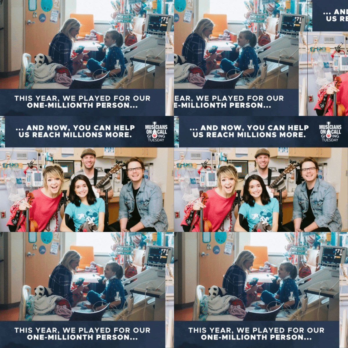
Here is an easy trend to use in your emails—animation. It doesn’t take much work to put a .gif together and most email marketing platforms allow you to add them. Animation is a great way to increase engagement in an email. The movement of the image catches supporters’ attention and gets them to stop.
But use caution with animation because it can become annoying, distracting, or dull.
Unicef used this simple .gif in an email to highlight the match opportunity. It’s enough animation to make you stop, but not so much that it becomes obnoxious.
Here is another .gif from an email, this one is from Musicians On Call. They use a slideshow effect that switches between two images.
Conclusion
With these eye-catching design elements, not only will your supporters spot your emails easier, but they will engage more. Don’t go crazy and use too many of these trends in one email. Try your hand at one or two, first.
Also, follow your brand guidelines, some of these trends won’t work with your organization’s voice or mission.
Along with excellent copy, email design will encourage your supporters to continue to open each of your emails. If the inbox is a game of Spot the Difference, your emails will win every time.
Joel Eaton is an experienced graphic designer and nonprofit marketer. He has helped many nonprofit organizations reach their funding goals, leveraging thoughtful design to assist in annual giving, major gifts, and acquisition. Joel's company "Preface" provides strategy, copy, and design with direct mail, email, annual reports, major donor proposals, logos, branding, event promotion, web design, digital marketing, and general graphic design.
Joel is also a hobby farmer who likes to talk about chickens, gardening, and regenerative agriculture. You can find out more about the great work Joel does on his website at prefacemarketing.com


